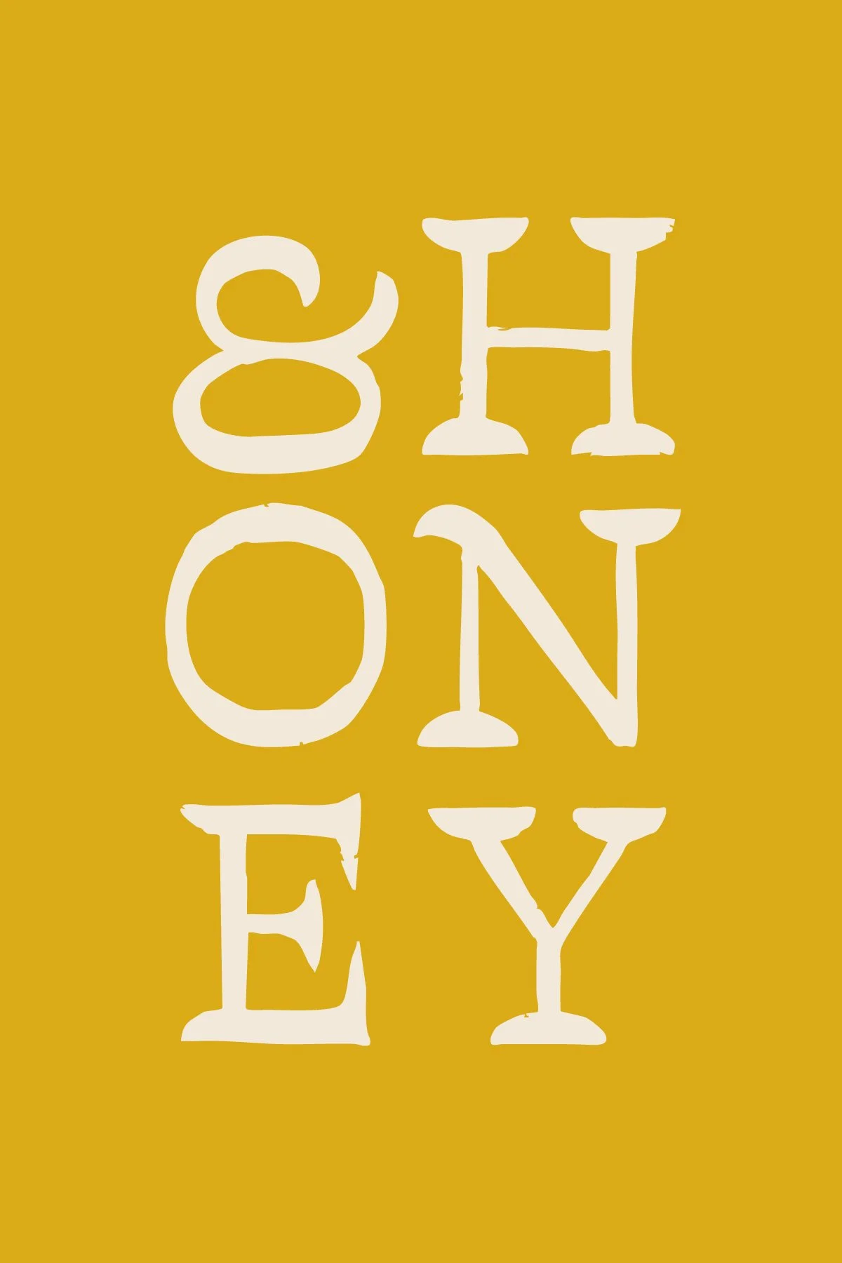
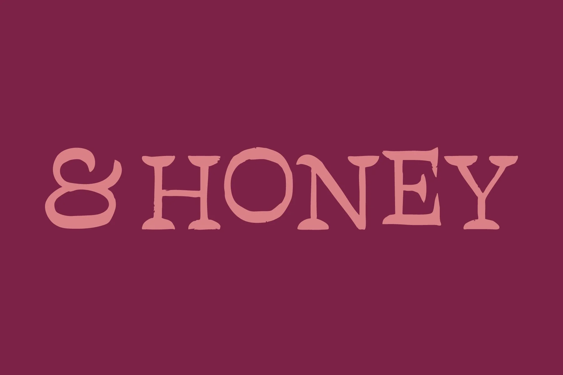
& Honey
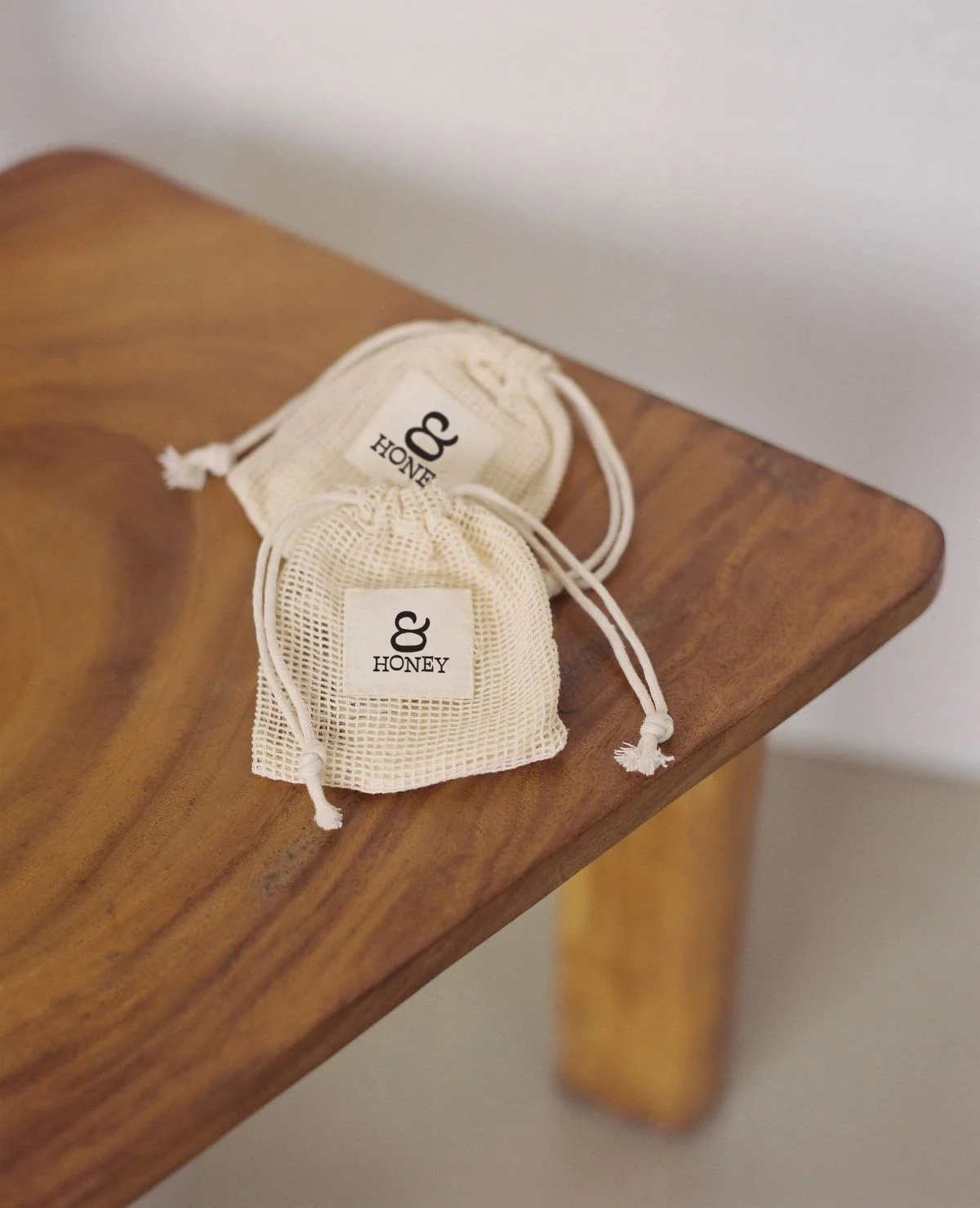
& Honey is a Gen-Z-owned company focused on providing tea to younger generations as an alternative to energy drinks or alcohol. They operate from a space of intentionality that is infused throughout their entire practice. From sourcing small-batch tea growers to prioritizing recyclability and sustainability in packaging, they aim to show care to the earth, their partners, and their friends, the customers.
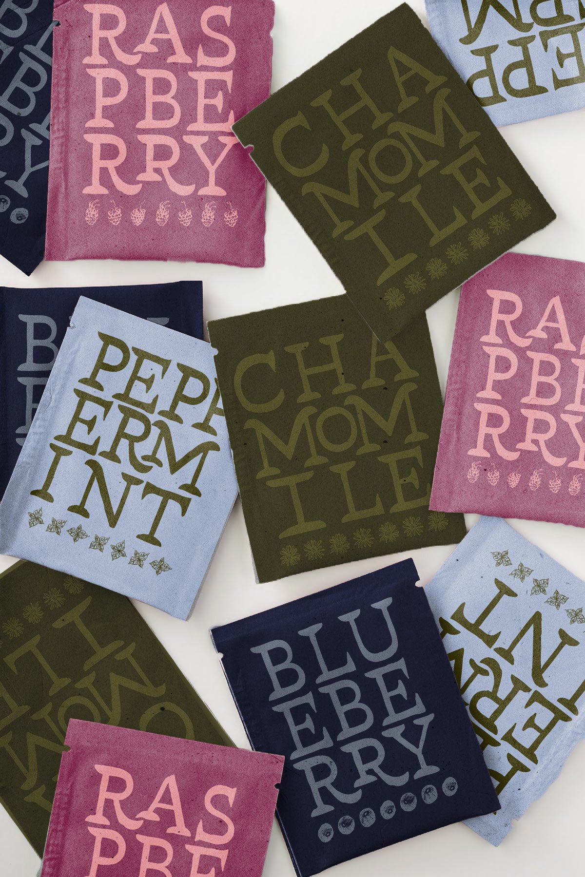
The goal was to introduce a tea company targeting Generation Z that embraced both the longstanding history and tradition of tea, while being inviting, playful, and energetic. The name “& Honey” has many potential allusions. It is natural, organic, and nourishing while being playful, energetic, and casual. The point is to allow the user to use their imagination to what word could be placed in front of the phrase.
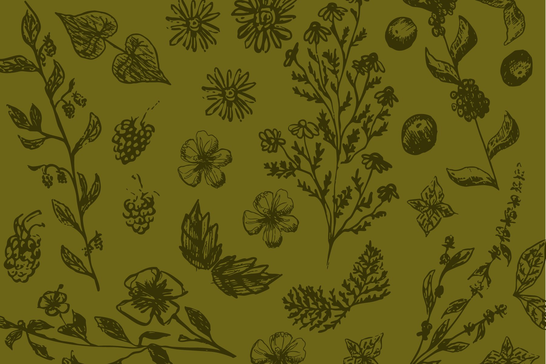
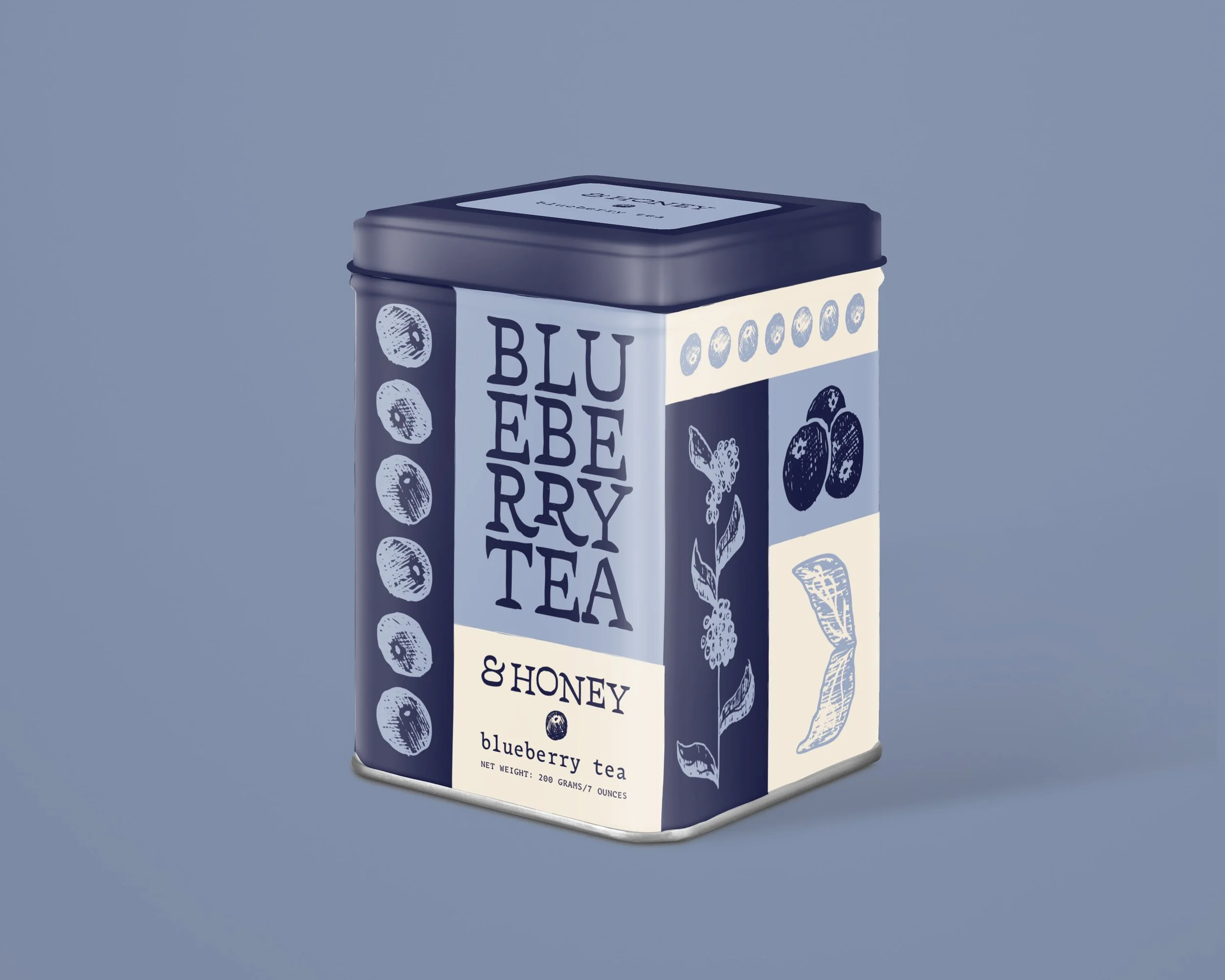
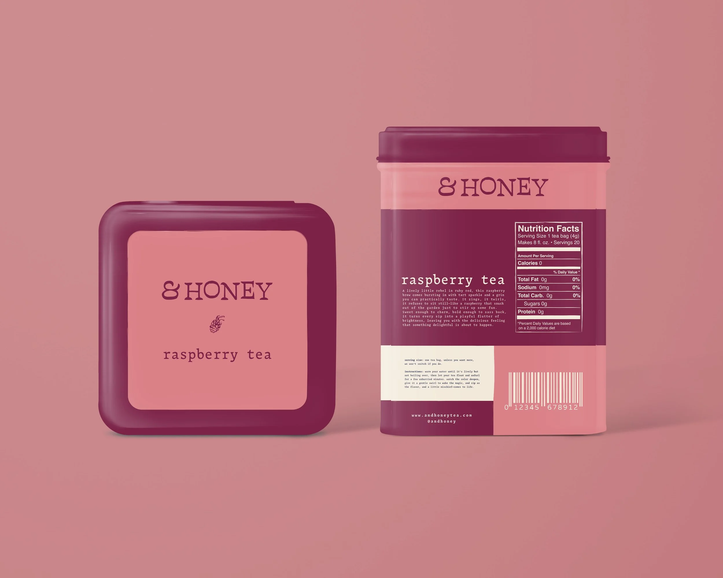
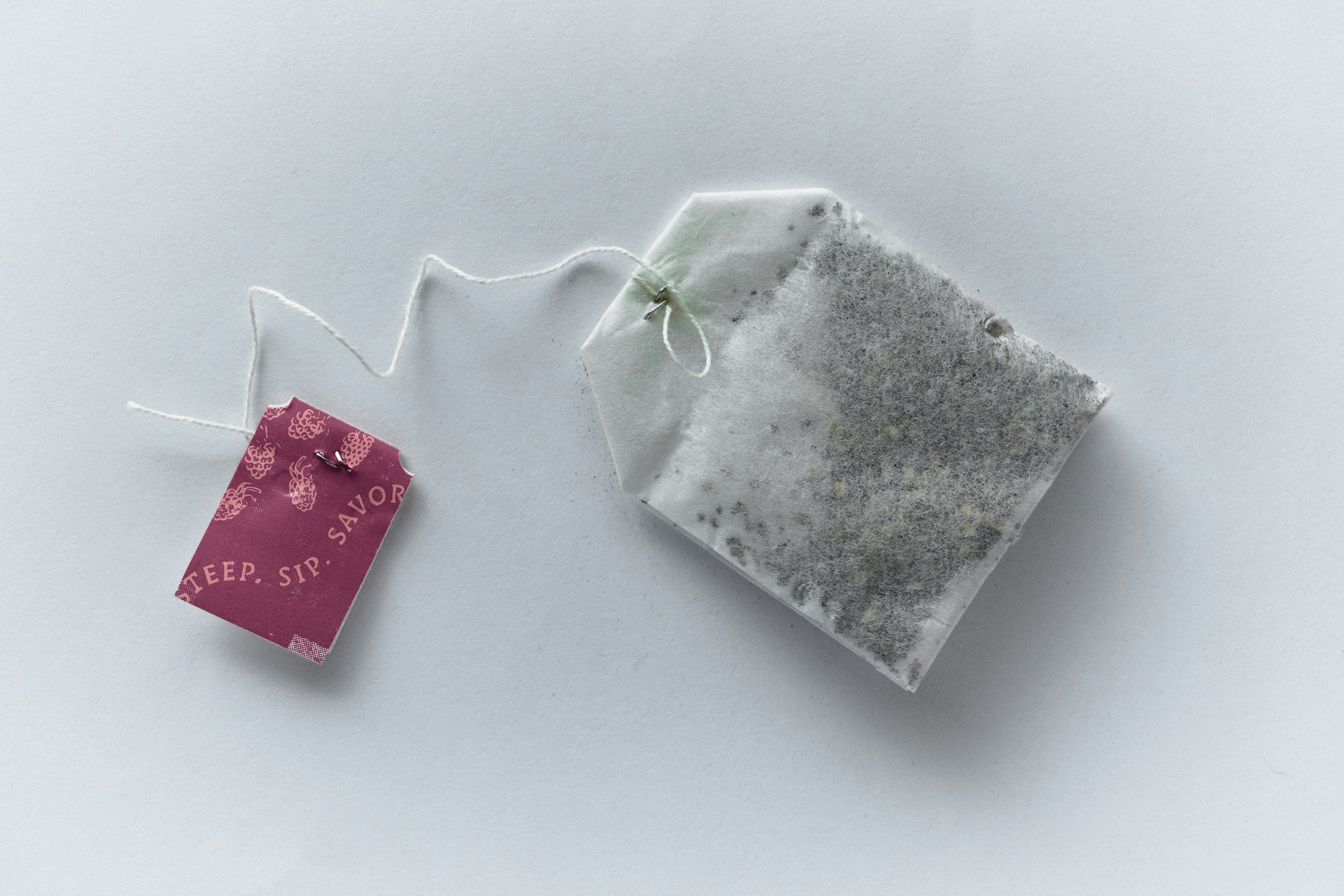
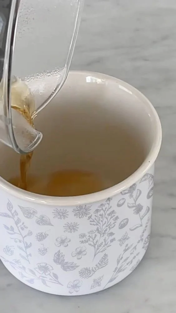
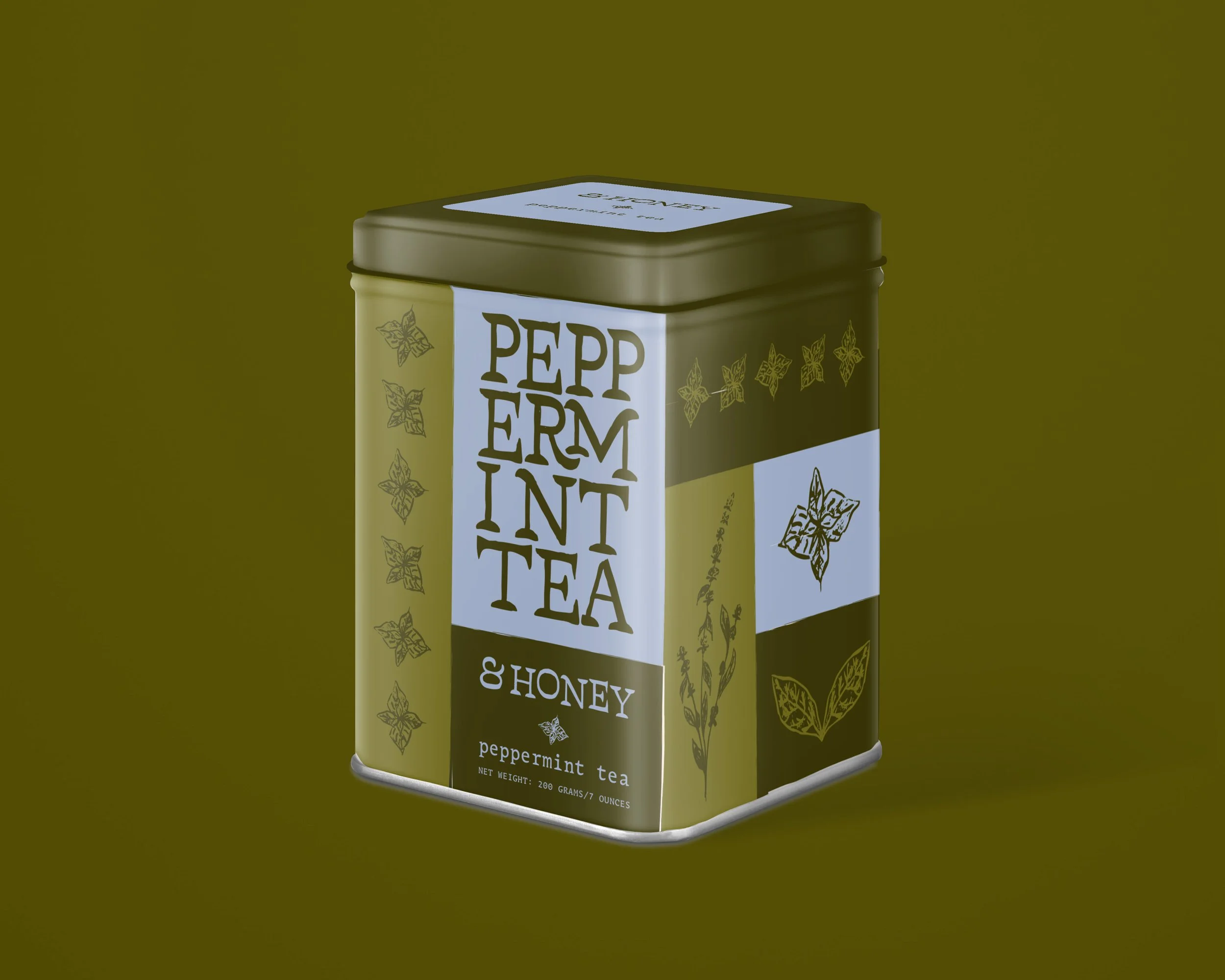
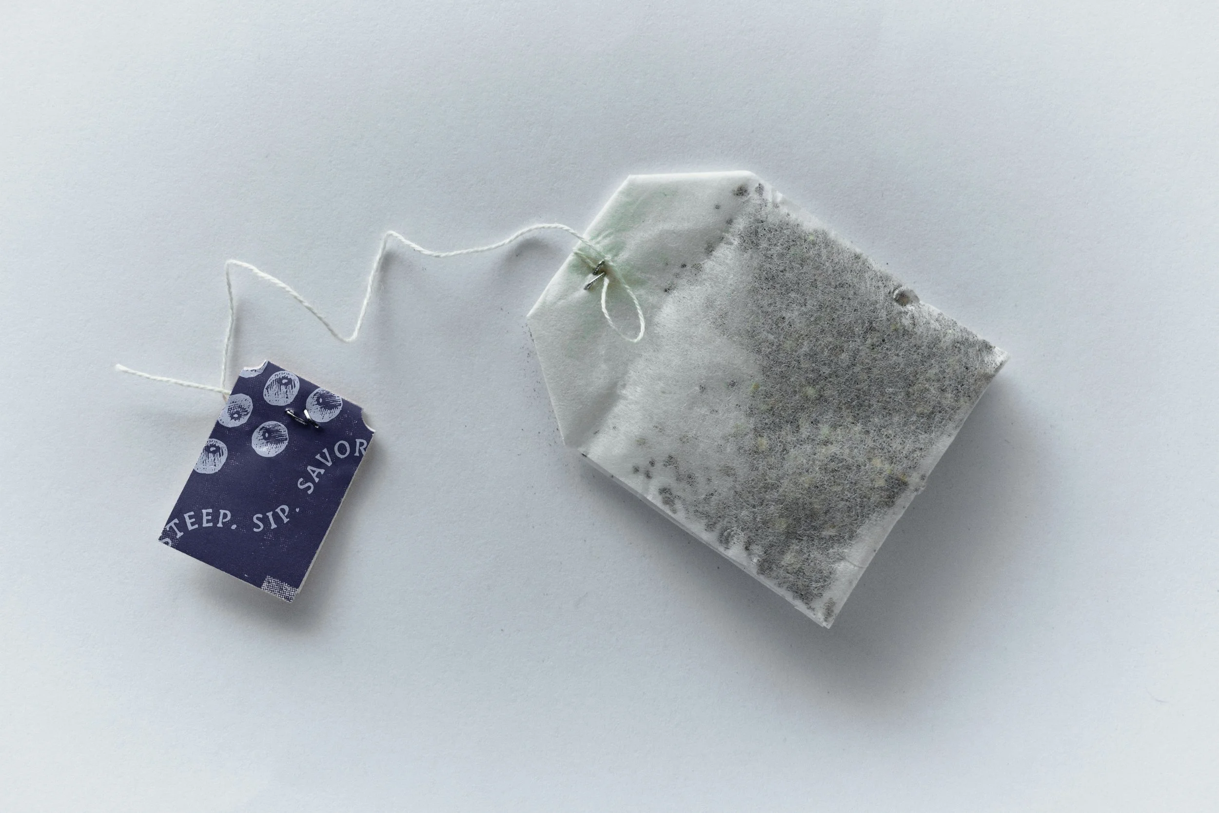
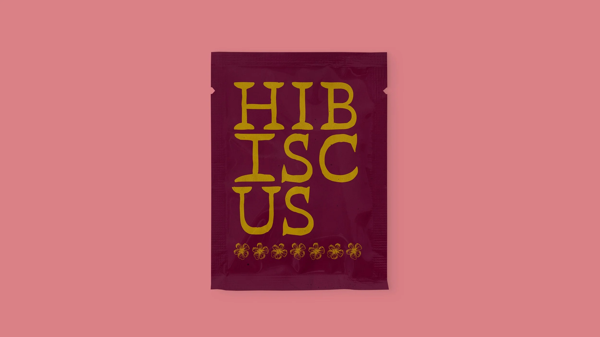
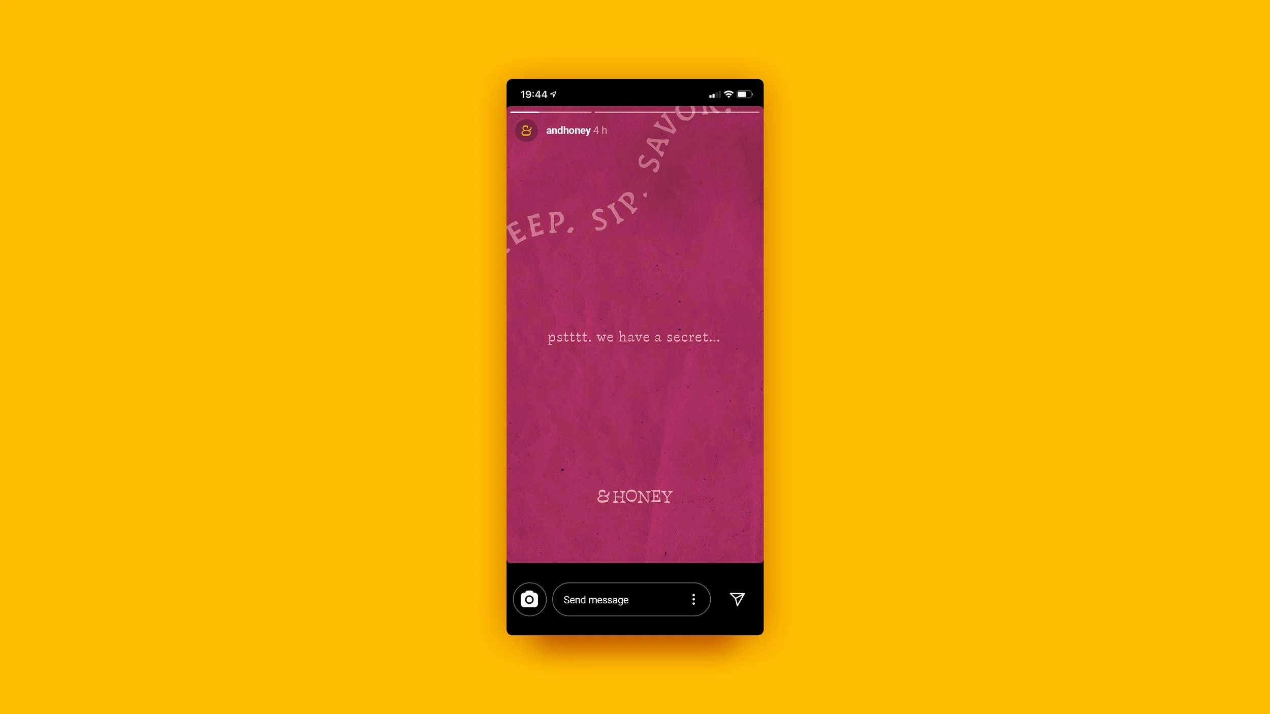
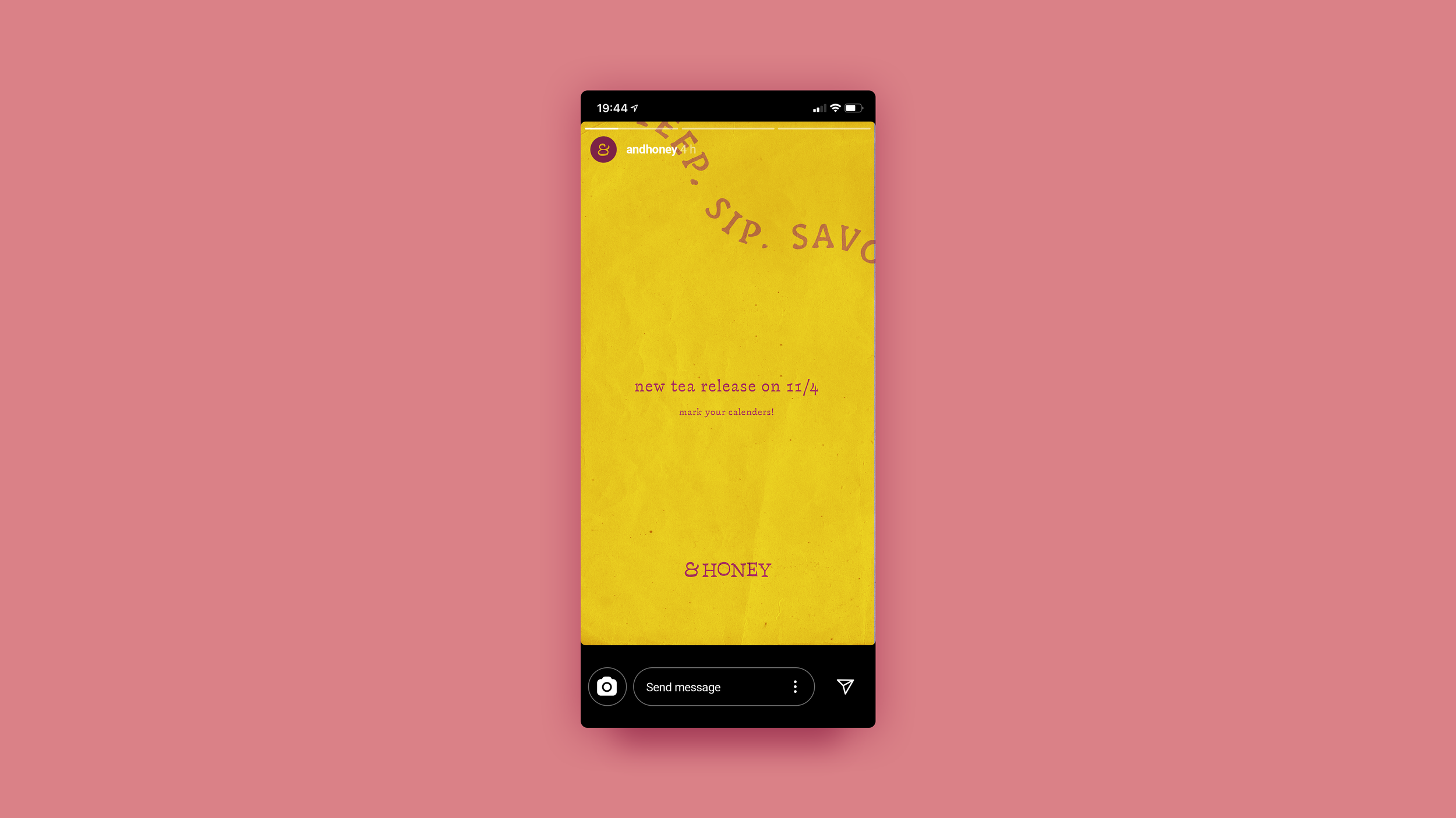
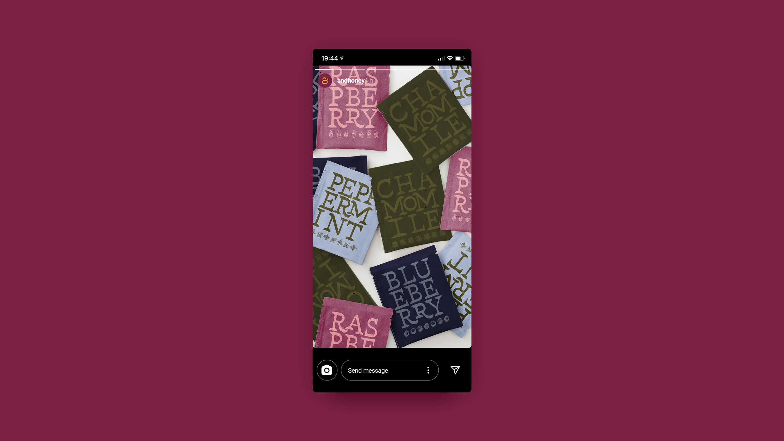
The solution is a brand identity that acts as comforting and slow as the act of tea is. It embraces a vast palette of jewel tones for new color combinations as the brand expands. The illustrations and typography are rendered with a sketch-like treatment to provide a whimsical and witty experience. From the popping open metal tea tin to the first warm sip, & Honey invites you to steep, sip, and savor, slowing down with intention.
Project Type
Brand Identity and System, and Packaging Design
Deliverables
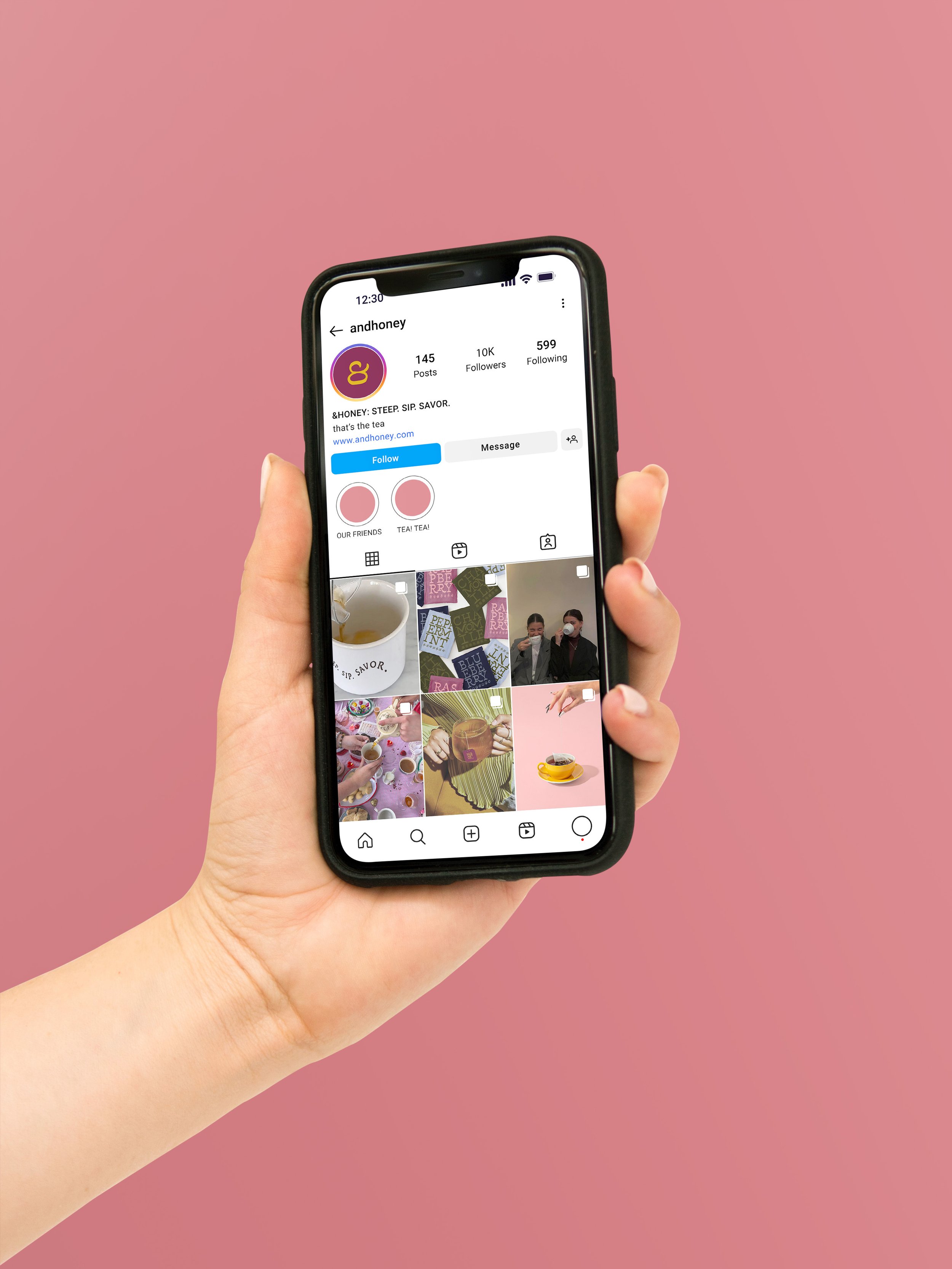
Brand Identity, Online Experience, Packaging Design

*For educational proof of concept only, some rights of imagery I do not own.