Philatelic
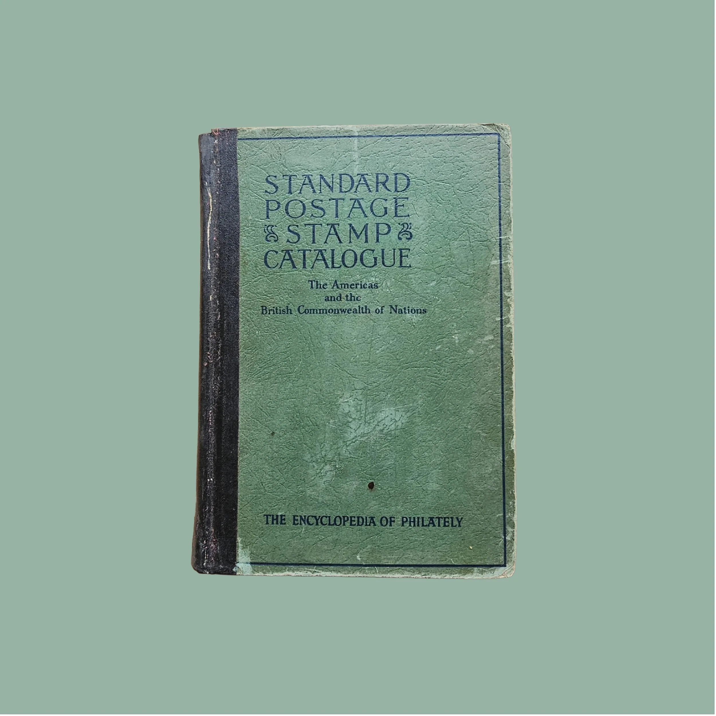
Unearthed from the sleepy stacks of a Gatlinburg antique store, the source material of Philatelic was discovered. Originating from the cover of the 1949 Scott Standard Postage Stamp Catalog, an annual publication by Scotts Publishing from New York City, New York, Philatelic can be traced back even further to the year 1919. The typography squeezes and stretches to span the width of the spine, creating inconsistencies. In the process of creating this typeface, a consistent set of serifs, thick and thin strokes, and widths had to be determined. In addition to the source material, a set of swashes was applied for more energetic usages.
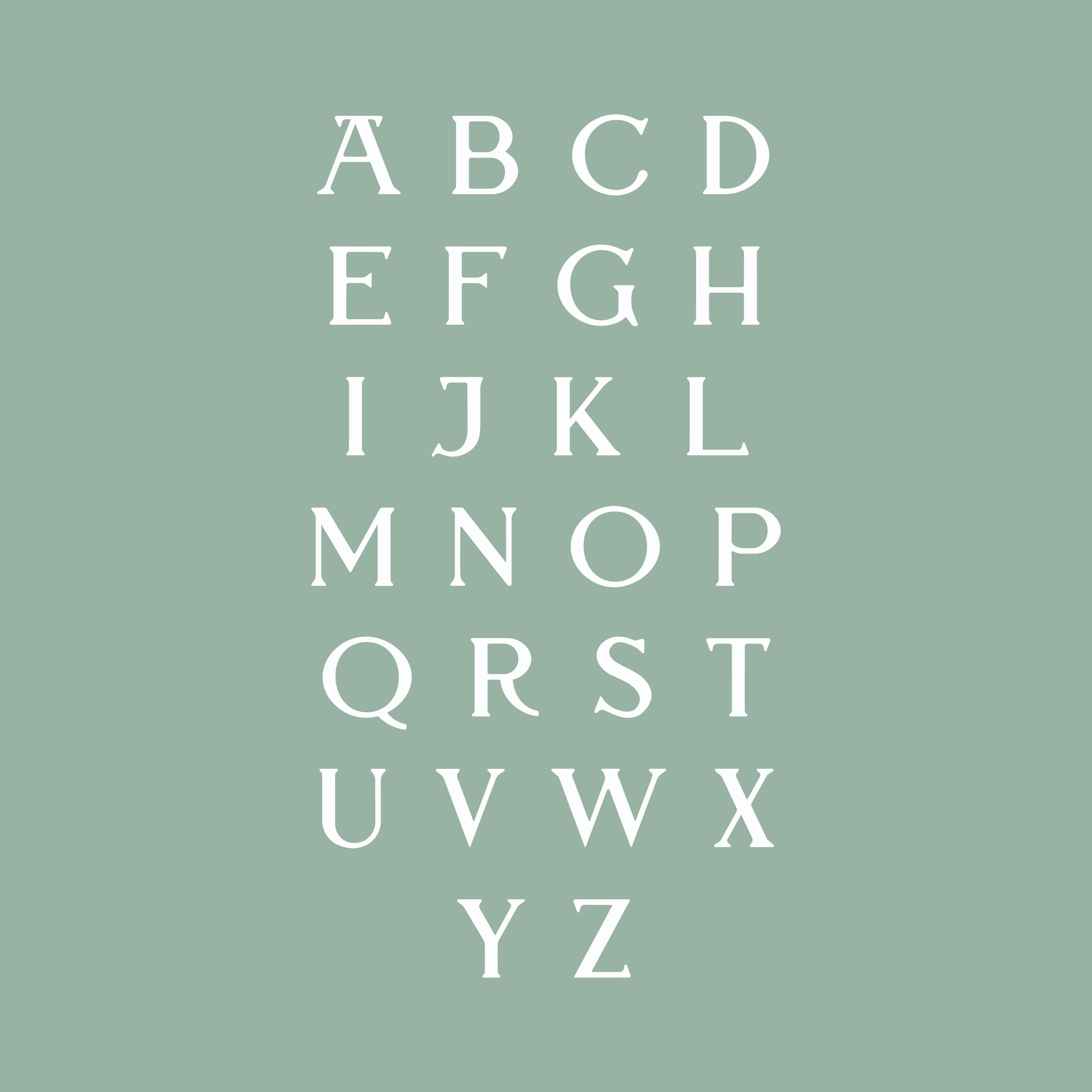
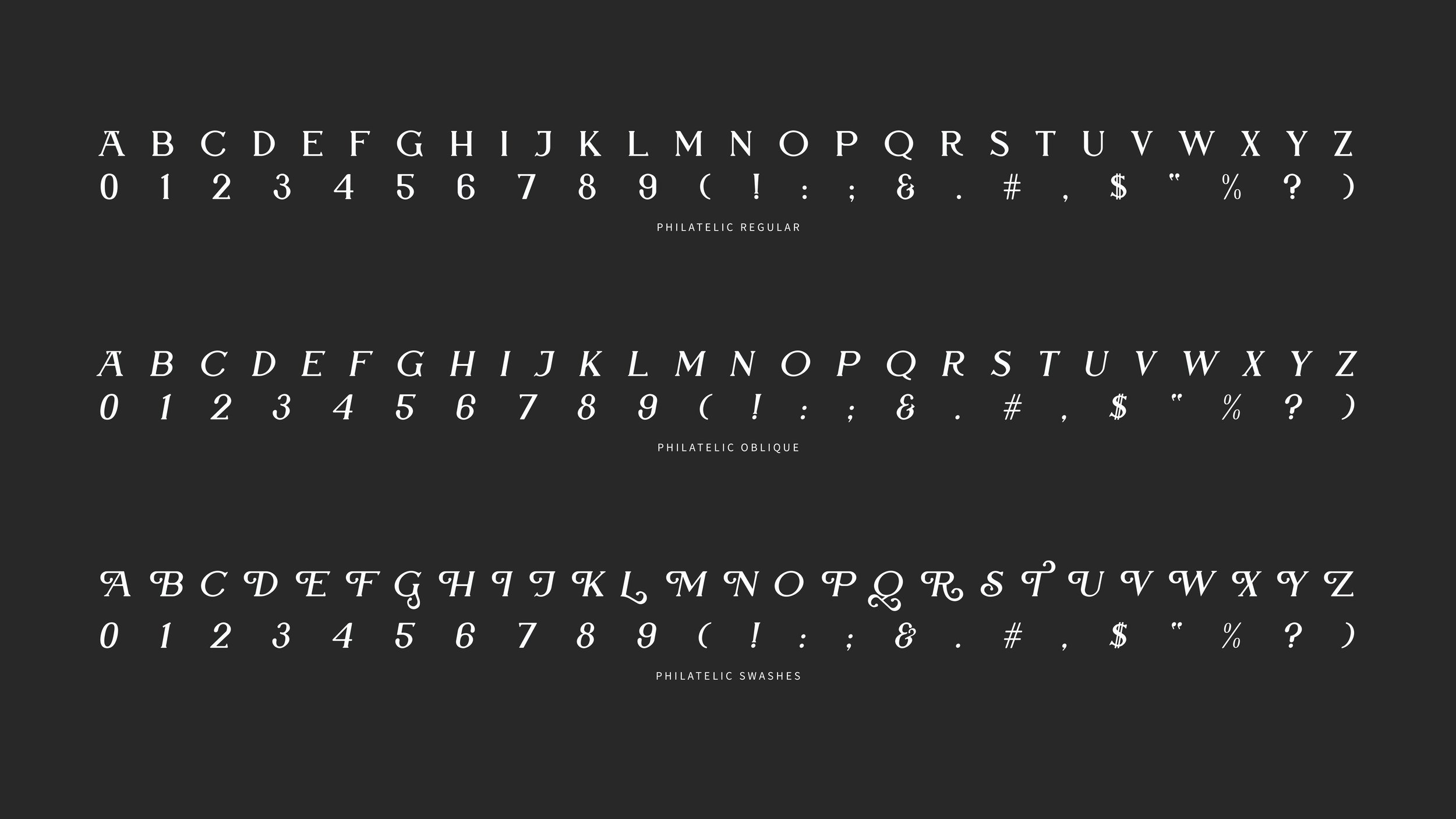
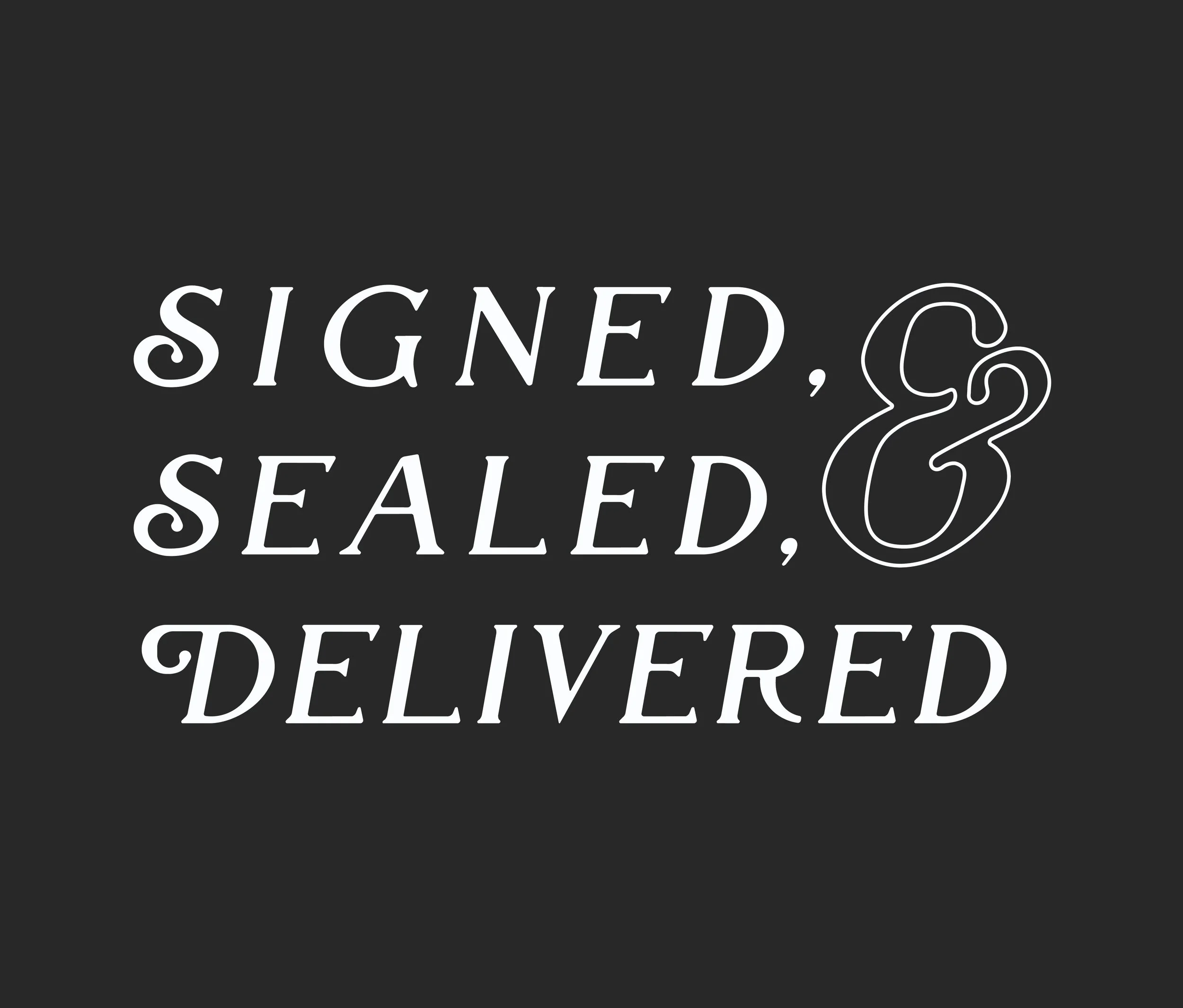
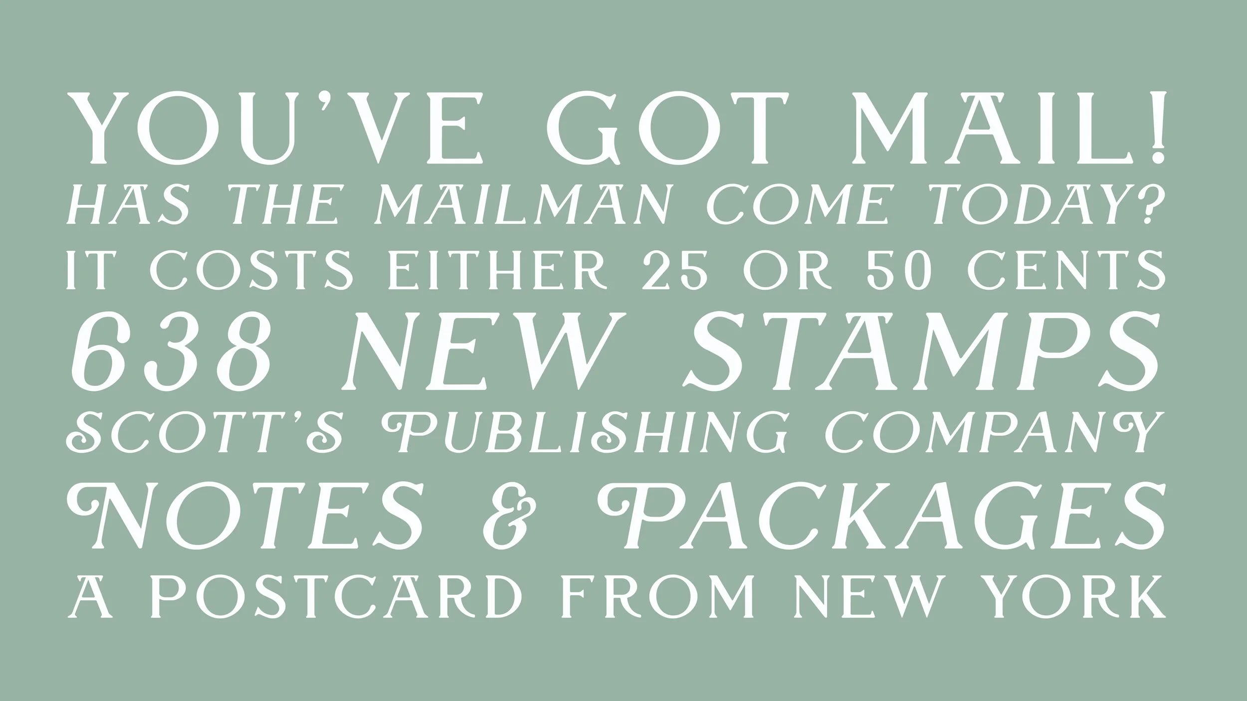
The rounded, yet traditional serifs of Philatelic offer an approachable and inviting feel for display use. The additional two styles, oblique and swashes, further maximize its potential applications. Elegant and energetic, Philatelic synthesizes the classic form of a serif with a charming softness.
Project Type
Typography Design
Deliverables
Typeface Design