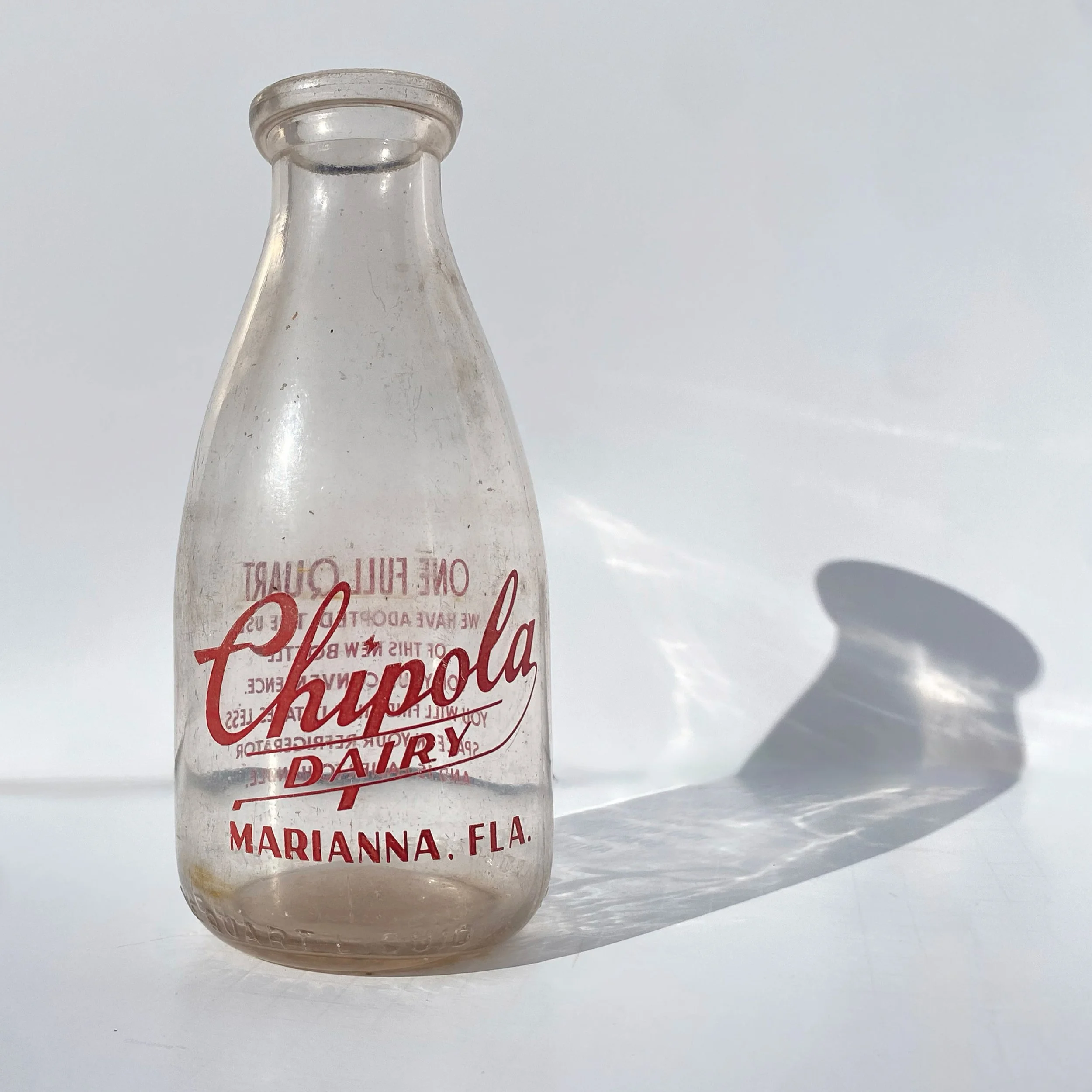
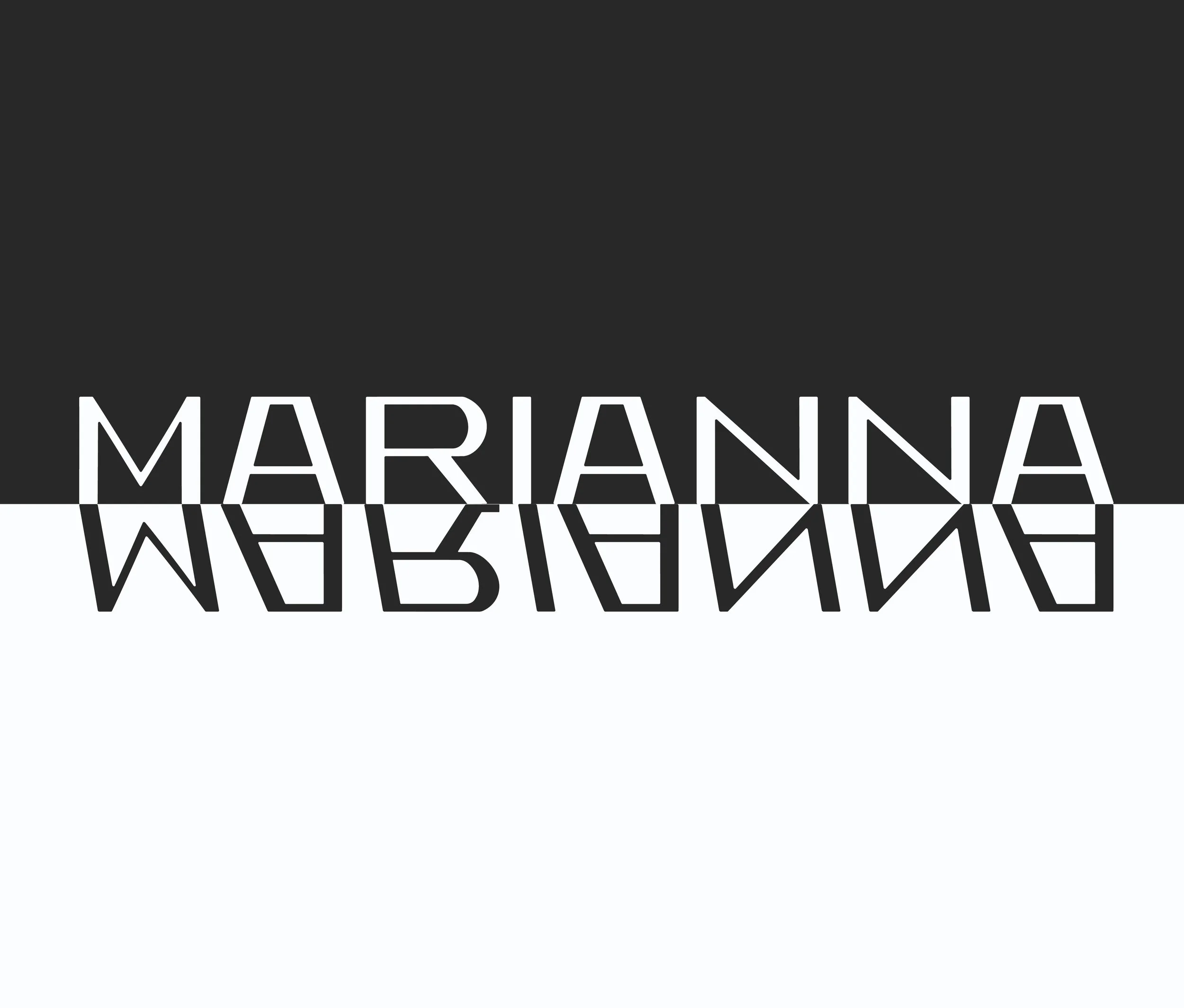
Chipola
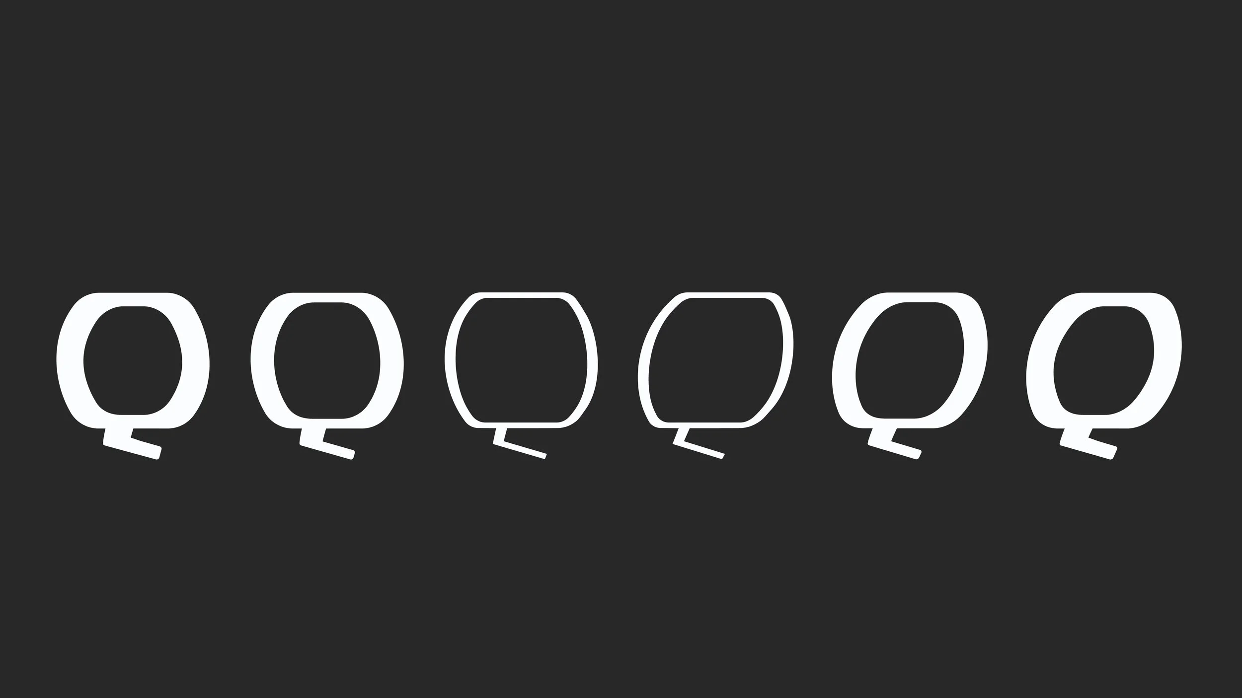
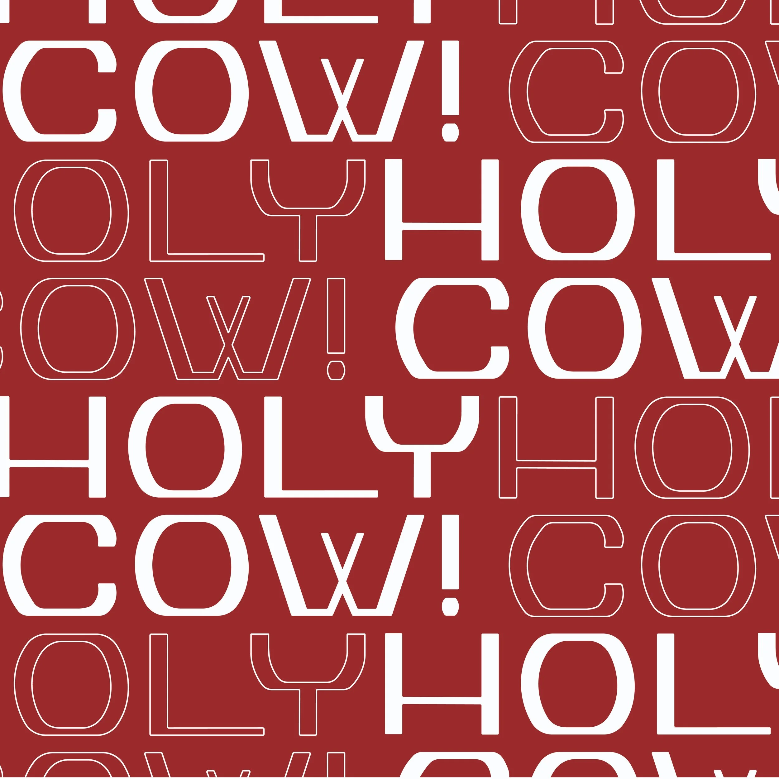
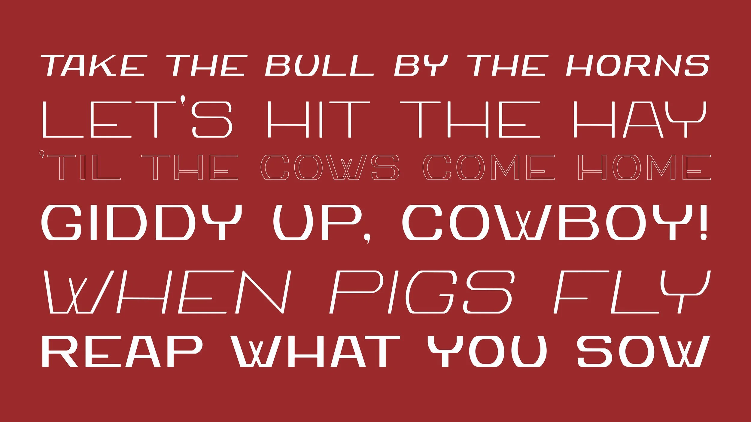
An ode to the past, the rotund structure of Chipola offers a new view of a bygone form. In the 1950s, the sleepy dairy farms in the Florida panhandle switched from glass bottles to plastic gallon jugs. In this shuffle, my great-grandfather kept a few, knowing they would be a piece of history one day. Over seventy years later, the letterforms on the side of a bottle would inspire Chipola. On the side of one of these glass bottles, circa 1945, Chipola takes inspiration from the five letters of the word “dairy.” Because its structural foundation was limited by five characters, establishing a cohesive system required knowing the main building blocks and expanding from there.
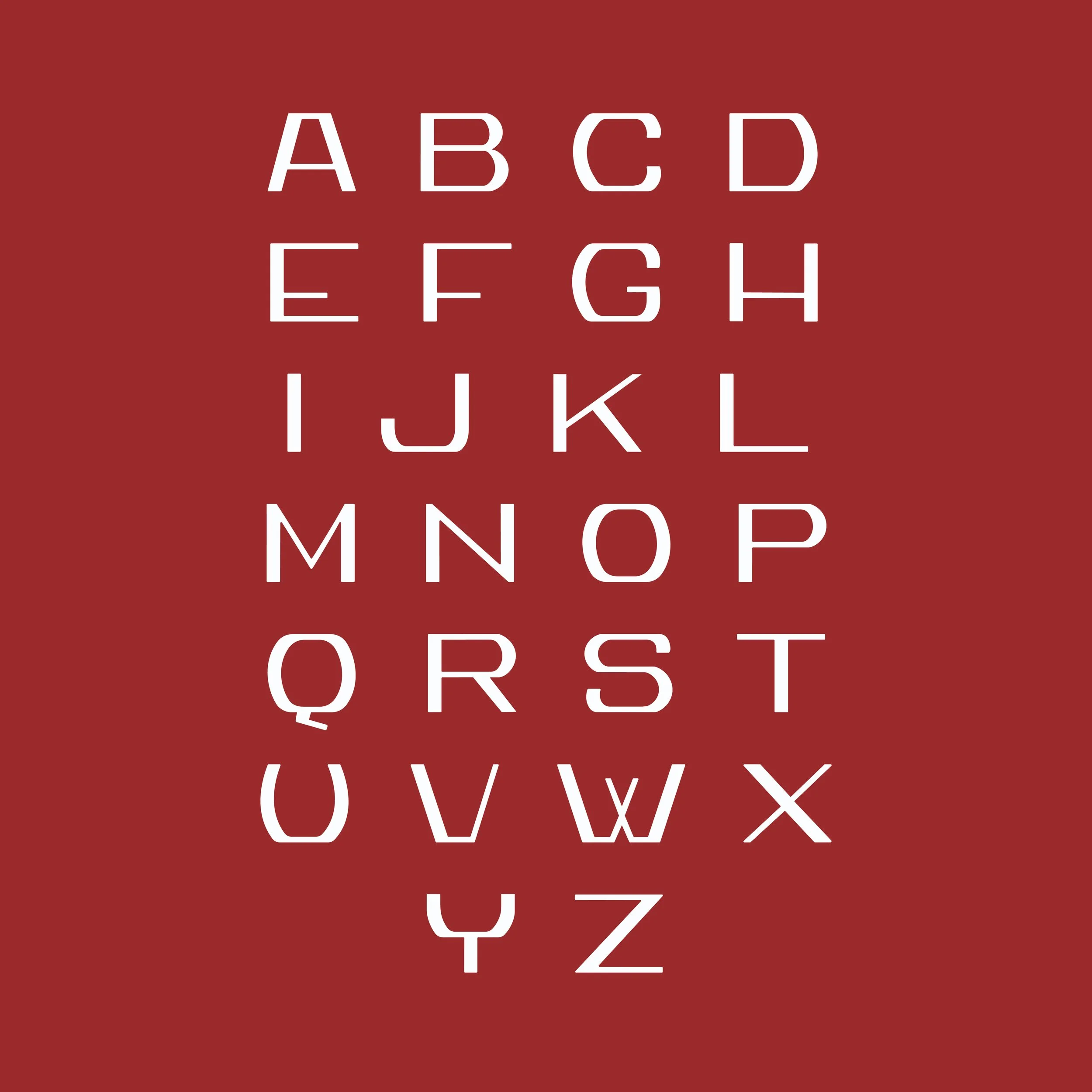
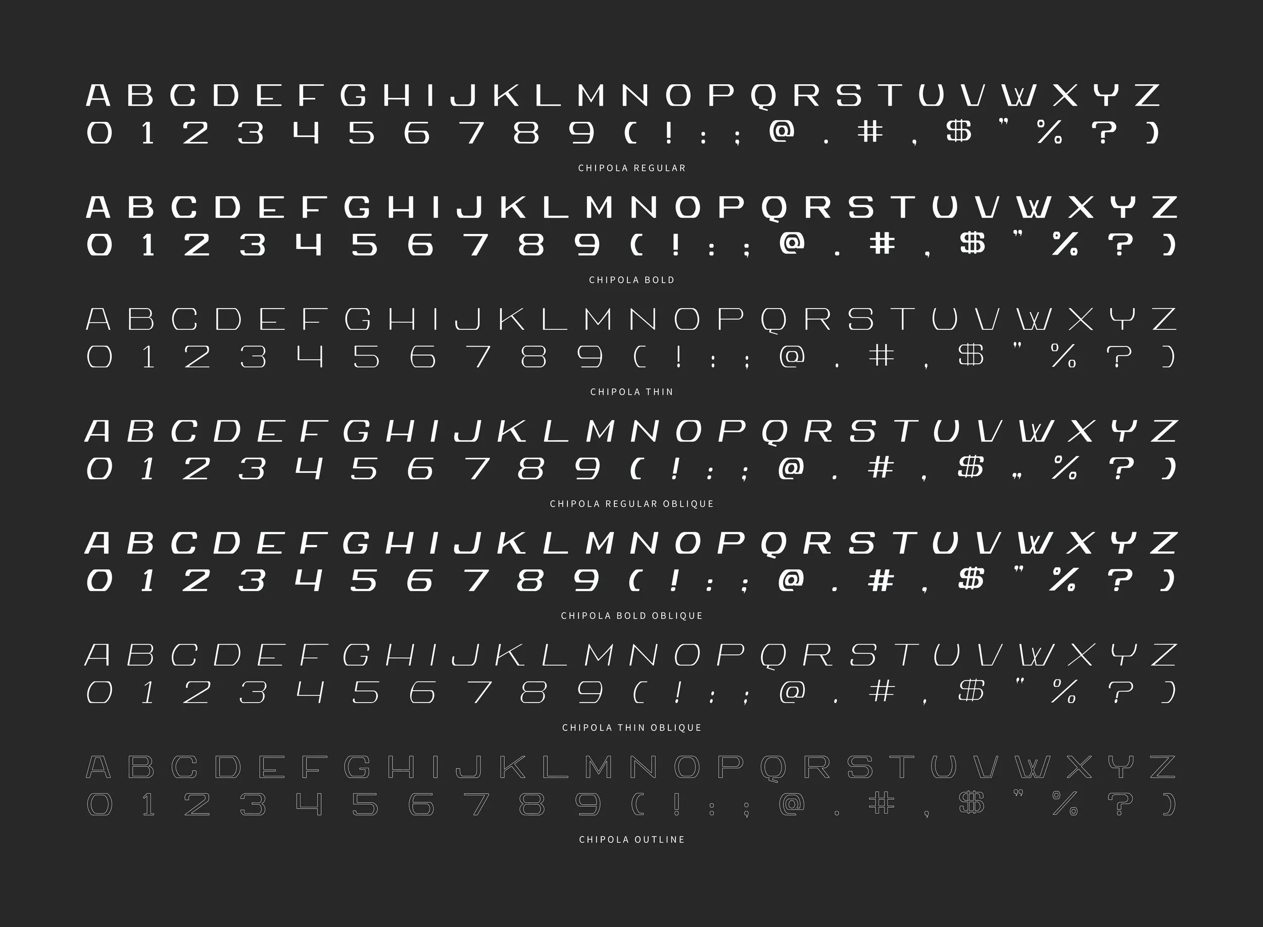
A display sans-serif typeface, the wide and bulbous letterforms offer an updated twist on the retro letterforms. The shift in stroke as a sans-serif typeface creates visual interest while maintaining simplicity. Chipola is made up of 3 weights and 3 styles for endless contexts.
Project Type
Typography Design
Deliverables
Typeface Design